Primitive
fs-stage-carousel
Emitted by render_stage_carousel (hero variant) — thin wrappers call the same helper.
Kitchen Sink
Design system
Use a stage carousel when a single slide should own attention — heroes, testimonials, image-first galleries.
Use a rail when several peers scroll horizontally — case studies, logos, related cards. Rails default to manual scroll
(snap + optional arrows); stage carousels support autoplay with pause on interaction and respect prefers-reduced-motion.
fs-stage-carouselBase track + viewport; variants add modifier classes only.
fs-hero-carouselWide stage with overlay copy and CTAs. Autoplay enabled below for demo (pauses on hover / focus / manual nav).

fs-gallery-carouselImage-first slides with caption overlay. First slide: lightbox; second: link; third: no action.
fs-thumb-galleryMain gallery plus thumbnail strip; thumbnails call the same controller as arrows and dots.
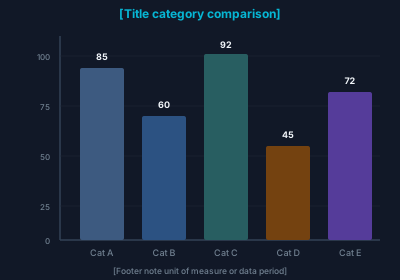
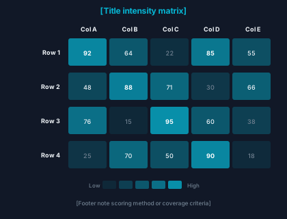
fs-railCSS scroll-snap scroller; arrows scroll by one viewport chunk. Card variant uses .forge-card.
fs-card-railFirst tile uses topic preview; others are plain links.
fs-logo-stripGrid

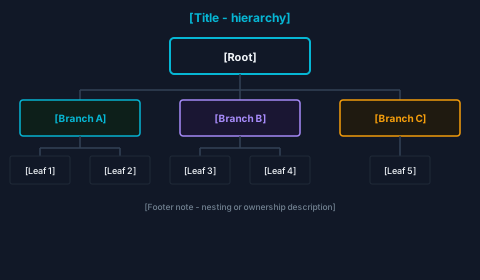
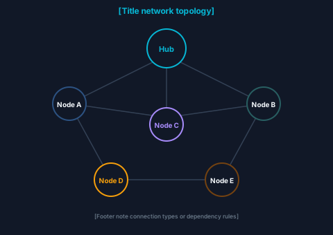

Rail (scroll-snap + arrows)
Marquee (static when reduced-motion)
Duplicated segment for seamless loop; animation disabled under prefers-reduced-motion.
fs-testimonial-sliderOne-up stage with quote typography; autoplay off by default.
The design system stayed coherent because we extended tokens and glass instead of bolting on a new kit.
Three minimal carousels showing preview_mode / hit targets.
Normal link
Topic preview modal
Image lightbox
marketing_sections.py
Composable blocks for enterprise-style homepages (KPI row, case study feature, advisor grid).
Requires forgesdlc-theme.css for stat glass and section spacing — this page already loads it via extra_css().
render_marketing_stat_band
Boost productivity
lift in teams rated top-tier.*
Manager effectiveness
lift in managers rated top-tier.*
Leadership development
average quota and NPS lift.*
Turnover and burnout
reduction in voluntary turnover.*
* Illustrative KPI band — replace with your study footnote.
render_case_study_spotlight
CASE STUDY
We stopped thrashing on scope because the methodology gave us a shared language for risk and evidence.
render_people_showcase
Headshots optional — placeholder initials when image_src is empty.
Peek rail with keyboard arrow scroll controls.
Editorial card 1
Editorial card 2
Editorial card 3
Editorial card 4
Editorial card 5
Editorial card 6
Expected behavior
ks-editorial-peek-rail
Arrow buttons and keyboard scroll the peek rail.